Support Vector Machines
This lesson will teach you about support vector machines.
What is SVM?
We previously talked about supervised learning algorithms and specifically the random forest model, which can be used for both regression problems and classification problems.
Now, let's take a look at another supervised learning algorithm: the Support Vector Machine (SVM).
The support vector machine is an algorithm used mainly for classification problems. In this algorithm, we plot each data entry as a point in n-dimensional space (where n is the number of features you have) with the value of each feature being the value of a particular coordinate.
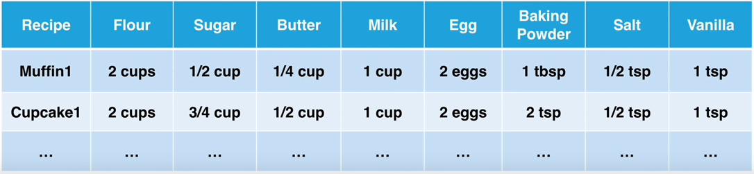
For example, let's say we have a classification problem where we have a dataset of cupcake and muffin recipes, and we want our machine to predict whether a recipe is for a cupcake or a muffin. We could use two features, amount of sugar and amount of flour in the recipe, and plot the label (whether the recipe is for a cupcake or a muffin) in this 2-D space.
The points/coordinates plotted are called support vectors.
If it looks like you're able to split the data into groups (like in this example) then we can use SVM to classify it.
The next step is to create a line that splits the data into the different classified groups. This line is called the hyperplane.
The hyperplane should be placed so it is the furthest it can be from the nearest support vectors in each group. The distance between the nearest support vector and the hyperplane is called the margin.
The goal is to maximize the margin as much as possible so we know we have split the data in the best way possible.
Classification Problem
Now that you understand how support vector machines work, let's use it to solve the muffins vs cupcakes classification problem.
First, create a new project in Spyder and save it as SVMClassification.
Then, create a new file inside the project and save it as classification.py. You can also delete the text that's already in the file.
Create a subfolder in your project called Datasets. Then download the dataset that we will be using and save it into the Datasets folder.
recipes_muffins_cupcakes.csv - A CSV file containing information about petrol consumption.
In your classification.py file, we are going import all of our necessary modules and classes:
Modules for Analysis:
pandas - for datasets
numpy - for arrays
svm from sklearn - for the svm algorithm
Modules for Visuals:
matplotlib.pyplot - for basic graphs
seaborn - prettier graphs (we will also set the font for our visuals to be slightly bigger using sns.set(font_scale = 1.2))
import pandas as pd
import numpy as np
from sklearn import svm
import matplotlib.pyplot as plt
import seaborn as sns; sns.set(font_scale=1.2)
Create a DataFrame using the CSV file
recipes_muffins_cupcakes.csv. Remember to create a relative reference to the file using 'Datasets/'
Now print the recipes DataFrame.
import pandas as pd
import numpy as np
from sklearn import svm
import matplotlib.pyplot as plt
import seaborn as sns; sns.set(font_scale=1.2)

recipes = pd.read_csv('Datasets/recipes_muffins_cupcakes.csv')
print(recipes)
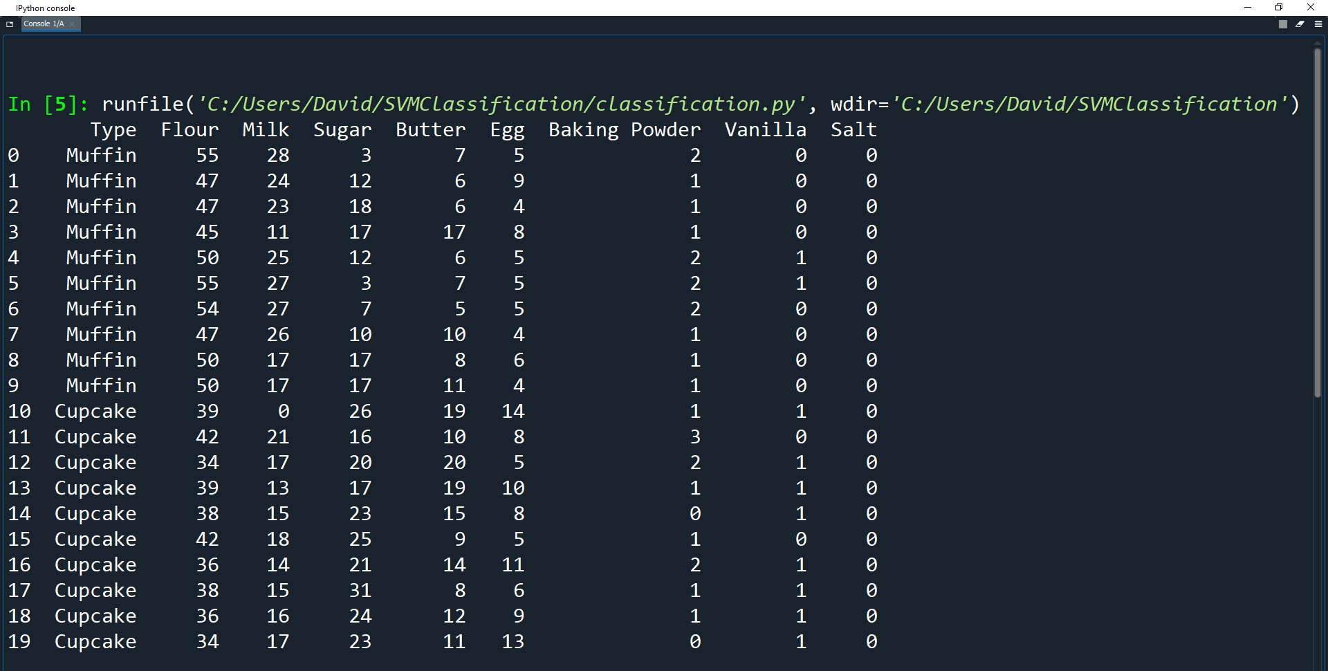
As you can see, the dataset already looks very neat and tidy. This is because it has already been cleaned for you so we can get straight into the training and testing.
The main problem with the original data was that the values for the ingredients used different measurements, such as cups, tbsp, tsp, and eggs.
These values also had different scales due to each recipe having different yields.
Therefore to fix these issues, the data had to be normalized by changing the data from being amount based to percent based.
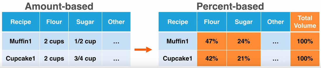
Fortunately for us, all of that cleanup has already occurred on the file. It would have been a lot of programming work to turn the data from an amount-based dataset to a percent-based dataset.
Visualizing the Data
Before we fit the model, let's see what our dataset looks like using visualization. Visualization can tell you a lot of information before you try to understand the dataset through a machine learning algorithm.
We will use seaborn to do this by calling the sns.lmplot() function to create a graph.
There are many parameters that can be used to construct the graph, but we will only use a few.
seaborn.lmplot(x, y, data=*, hue='*', palette='*', fit_reg=*, scatter_kws={"*": *});
Parameters:
x, y - We pass strings into the x and y variables here to be the names of the axes. These should be any features (columns) from the dataset.
data=* - Here we assign a tidy dataframe to
datawhere each column is a variable and each row is an observation
hue - Here we assign a string to
huethat defines the subsets of the data (in our case
Typei.e the type of food)
palette - Here we assign a string to
palettethat defines the colors to use for the different subsets.
fit_reg - Here we assign a bool value to fit_reg. If True, the graph will estimate and plot a regression model relating the x and y variables. This will give us a hint as to the relationship between the two variables.
scatter_kws - Here we can assign a dictionary of additional keyword arguments which edit further how the graph will look.
You can read more about seaborn.lmplot() and its parameters here.
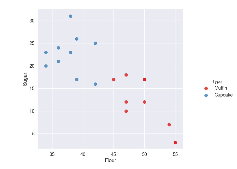
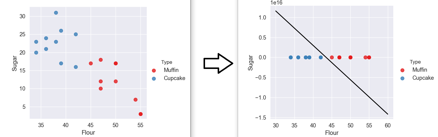
We will use the sugar and flour features as our axes since those amounts seem to differ based on if the recipe is for a muffin or cupcake.
We will pass our recipes dataset in, use our Type column as the hue, use color Set1 for the color palette of the graph and we won't draw a regression line by setting fit_reg to False.
scatter_kws={"s": 70} just sets the size of our plots.
Here are the parameter values we will use to create our graph:
recipes = pd.read_csv('Datasets/recipes_muffins_cupcakes.csv')

sns.lmplot('Flour', 'Sugar', data=recipes, hue='Type', palette='Set1', fit_reg=False, scatter_kws={"s": 70})
plt.show()
We then use the plt.show() function from matplotlib to display our new graph.
Remember when we talked about the different panes in spyder? Well, if you go to the section above the console and click on the plots tab you will see your graph is displayed there.
This is why visualizing data truly is beautiful. We can now see that muffins and cupcakes can indeed be classified based on their sugar and flour contents. Feel free to try out other variables as well and see if there are other variables that can provide a way of classifying muffins and cupcakes.
Muffins appear to have low amounts of sugar and high amounts of flower, while cupcakes appear to have high amounts of sugar and low amounts of flower.
You can comment out the visualization code so it doesn't create a new graph every time we run the program.
#sns.lmplot('Flour', 'Sugar', data=recipes, hue='Type', palette='Set1', fit_reg=False, scatter_kws={"s": 70});
#plt.show()
Fitting the SVM Model
Now let's actually use this data to fit (train) a support vector machine model. First we must specify features (inputs) and labels (outputs) for the model.
#sns.lmplot('Flour', 'Sugar', data=recipes, hue='Type', palette='Set1', fit_reg=False, scatter_kws={"s": 70});
#plt.show()

features = recipes[['Flour', 'Sugar']].to_numpy()
label = np.where(recipes['Type'] == 'Muffin', 0, 1)
Here we get the Flour and Sugar columns from the DataFrame and convert them into a numpy array using to_numpy().
Then we use np.where() to create a numpy array of zeros and ones. np.where() will go through every element in the
Typecolumn and check whether the element is equal to
Muffin.
If the element is equal to
Muffinthen we add a 0 to the array, otherwise we add a 1 to the array.
Now let's actually create the SVM model and fit it to our data.
features = recipes[['Flour', 'Sugar']].to_numpy()
label = np.where(recipes['Type'] == 'Muffin', 0, 1)

model = svm.SVC(kernel='linear')
model.fit(features, label)
Here we create a model using Scikit-Learn's svm.SVC() function. This creates a support vector machine (svm) object that is specifically for Support Vector Classification (SVC).
We set the kernel parameter to
linearwhich just ensures that the model separates the data linearly with a single hyperplane.
This is one of the most common kernels to use, and training with this is faster than with any other kernel.
Finally, we fit the model with our features and labels. Now that we've trained the model, let's visualize what it looks like.
This code is a bit more complicated, but it basically just creates a graph using data from our model.
model = svm.SVC(kernel='linear')
model.fit(features, label)
# Get the separating hyperplane
w = model.coef_[0]
a = -w[0] / w[1]
xx = np.linspace(30, 60)
yy = a * xx - (model.intercept_[0]) / w[1]
# Plot the parallels to the separating hyperplane that pass through the support vectors
b = model.support_vectors_[0]
yy_down = a * xx + (b[1] - a * b[0])
b = model.support_vectors_[-1]
yy_up = a * xx + (b[1] - a * b[0])
# Plot the hyperplane
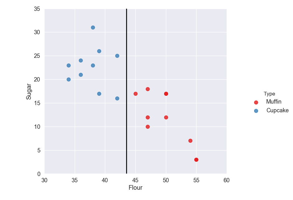
sns.lmplot('Flour', 'Sugar', data=recipes, hue='Type', palette='Set1', fit_reg=False, scatter_kws={"s": 70})
plt.plot(xx, yy, linewidth=2, color='black')
plt.show()
As you can see we have our hyperplane which separates our muffins from our cupcakes.
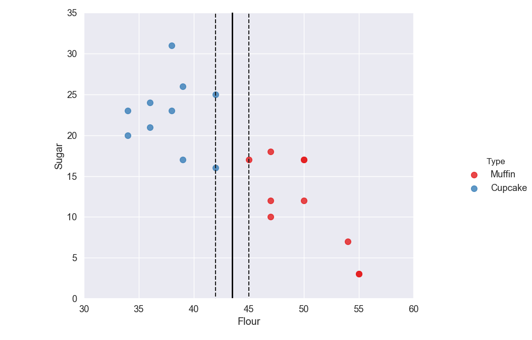
Let's create a new graph that also includes our margins and support vectors. Add the code below to do this.
# Plot the hyperplane
sns.lmplot('Flour', 'Sugar', data=recipes, hue='Type', palette='Set1', fit_reg=False, scatter_kws={"s": 70})
plt.plot(xx, yy, linewidth=2, color='black');

# Look at the margins and support vectors
sns.lmplot('Flour', 'Sugar', data=recipes, hue='Type', palette='Set1', fit_reg=False, scatter_kws={"s": 70})
plt.plot(xx, yy, linewidth=2, color='black')
plt.plot(xx, yy_down, 'k--')
plt.plot(xx, yy_up, 'k--')
plt.scatter(model.support_vectors_[:, 0], model.support_vectors_[:, 1], s=80, facecolors='none')

plt.show()

Why is it Flat?
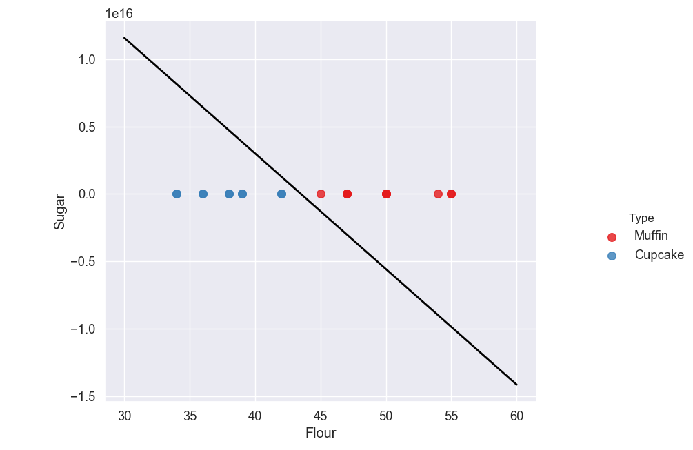
You may notice that the scale on our y-axis (Sugar) has changed, making the points appear on top of each other all on the line y = 0.
If you look at the top left of the graph you will see 1e16 which is the multiplier that is used to scale our y-axis. 1e16 just means 1 to the power of 16, which is 10,000,000,000,000,000.
We can see the real values on the y-axis by changing the format of the numbers. This can be done using plt.ticklabel_format().
# Look at the margins and support vectors
sns.lmplot('Flour', 'Sugar', data=recipes, hue='Type', palette='Set1', fit_reg=False, scatter_kws={"s": 70})
plt.plot(xx, yy, linewidth=2, color='black')
plt.plot(xx, yy_down, 'k--')
plt.plot(xx, yy_up, 'k--')
plt.scatter(model.support_vectors_[:, 0], model.support_vectors_[:, 1], s=80, facecolors='none');

plt.ticklabel_format(style='plain', axis='y')

plt.show()
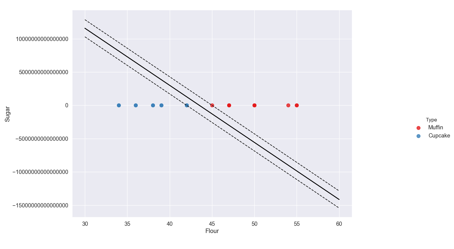
As you can see, the values on the y-axis are huge which is why the support vectors appear to be on top of each other at y = 0.
This is not actually the case, the scale is just so big that they appear relatively close together. Delete the ticklabel_format line to go back to scientific notation.
So why is this happening? Before we had a nice spaced out plot but when we created our hyperplane line, the scale increased.
Basically, the algorithm tried to create a hyperplane line with no misclassification. If you look at the original data graph, you can see that if we tried to draw a line to separate the data, keeping all the blues on one side and all the reds on another, it would have to be almost completely vertical.
This is what our algorithm did. When we display the data with the hyperplane, the line will always try to be perfectly diagonal across our graph which is why the data gets scaled and appears flattened.
However, we can specify what range we want our axis to have using the plt.axis() function.
plt.scatter(model.support_vectors_[:, 0], model.support_vectors_[:, 1], s=80, facecolors='none');

plt.axis([30, 60, 0, 35])

plt.show()
Here we set our x-axis to range from 30 to 60 and we set our y-axis to range from 0 to 35.
As you can see, the scale is back to how it was originally and the line appears horizontal.
Just remember the model and the data are still the same, the only thing we have changed is the scale on the axes.
Predicting New Cases
If you remember how supervised learning algorithms work, you may be confused why we fed all of our data into the training set and didn't creating a testing set.
Technically, you do not need a testing set to create a machine learning model. The training set is used to fit the model while the testing set is just for our own usage, to evaluate how good the model is.
Now, it is recommended that whenever you create a supervised learning model, you create a testing set and calculate the accuracy. However, because we could visualize our model to determine whether or not it would accurately predict cupcakes versus muffins, we didn't need to perform mathematical analysis on our algorithm to determine its accuracy.
Now, we are going to create a function that will allow us to feed test data into it and will use the model to tell us what the output is.
In this case, our function will take in two arguments: the percentage of flour in a recipe and the percentage of sugar in a recipe.
It will then tell us whether the recipe is for a muffin or a cupcake.
plt.show()

def muffin_or_cupcake(flour, sugar):
    if(model.predict([[flour, sugar]]))==0:
        print("You're looking at a muffin recipe!")
    else:
        print("You're looking at a cupcake recipe!")
As you can see, we have the muffin_or_cupcake function that takes two arguments.
We pass the arguments into the model.predict() function and check if the model predicts a 0, which means the recipe is a muffin recipe.
Remember that earlier when we created our label array, we used a value of 0 for muffins and a value of 1 for cupcakes.
Therefore if the model predicts a 0, the function tells us that the recipe is for muffins. Otherwise the function will tell us that the recipe is for cupcakes.
Let's try out this function using a recipe with 50% flour and 20% sugar.
def muffin_or_cupcake(flour, sugar):
    if(model.predict([[flour, sugar]]))==0:
        print("You're looking at a muffin recipe!")
    else:
        print("You're looking at a cupcake recipe!")

muffin_or_cupcake(50, 20)

Amazing! You now have a working function that uses the model to predict whether a recipe is a muffin or a cupcake based solely on its flour and sugar contents.
As a challenge, try changing the ingredients you use as features to classify the cakes. For example, you could use sugar and butter instead. Are there any features that make bad predictors of the recipe classification?