Graphs - Matplotlib
Now that we know the basics of pandas, we're going to use the module matplotlib to create graphs visualizing our data.
Data Science Clients
As a data scientist, you may often find yourself studying areas you don't know a lot about, providing information for people who think they know a lot about their area. So you've never been a pokemon trainer, but by using data you can help pokemon trainers make better decisions.
We're going to be helping a trainer named Ash. Ash is training to become a pokemon master. But he's run into a few bumps along the way. If he's going to become the pokemon master, he's going to need a little help.
You talk to Ash about their pokemon training.
I don't understand why I keep losing,he tells you,
My pikachu is the best pokemon!
Hmmm...that's a pretty big claim. Maybe let's take a look at pikachu in our data set and see what we can find? Ash may think he understands pokemon, but without looking at the data he may not have the full picture.
In the last lesson, you learned how to do quantitative analysis of various pokemon. But showing Ash the numbers may not be the right way to explain to him what's going on. By using Matplotlib to create graphs of the data, you can show Ash the data in a way that he can understand.
Ash's Pikachu
First, make sure that the Pokemon.csv you downloaded is in the same location, and create a new python file called
pokemonGraphs.py
If you don't have the file, you can download it again here: Pokemon.csv
We'll do the pandas import like we did last time, and we'll also import the necessary plotting functionality from matplotlib.
import pandas as pd
from matplotlib import pyplot as plt

poke = pd.read_csv("Pokemon.csv")
Next, we're going to make a subset of our data with only 5 columns.
Then, we'll take a look at Pikachu again.
import pandas as pd
from matplotlib import pyplot as plt
poke = pd.read_csv("Pokemon.csv")
poke_stats = poke[['Name', 'Type 1', 'Total', 'Generation', 'Legendary']]
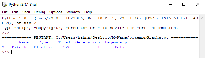
print(poke_stats[poke_stats['Name'] == 'Pikachu'])
This gives us simplified table that we can use to compare pokemon by their stats, poke_stats(), and we can now see that Pikachu's total power is 320.
We'll use the mean() aggregator to determine what the average pokemon's strength is.
import pandas as pd
from matplotlib import pyplot as plt

poke = pd.read_csv("Pokemon.csv")

poke_stats = poke[['Name', 'Type 1', 'Total', 'Generation', 'Legendary']]

print(poke_stats[poke_stats['Name'] == 'Pikachu'])

print("\nAverage Pokemon's Total Power")
print(poke_stats.Total.mean())
You try to break the news gently to Ash that pikachu isn't actually the best pokemon or even above average.
But wait!Ash tells you,
You can't compare pikachu's power to legendary and mega pokemon!
Well, he's right on that point. Let's re-do the math only comparing pikachu to other common pokemon, and remove duplicates as well, like we did in the last lesson.
You can decide whether or not you want to break this up into multiple steps, or do it all on one line.
import pandas as pd
from matplotlib import pyplot as plt
poke = pd.read_csv("Pokemon.csv")
poke_stats = poke[['Name', 'Type 1', 'Total', 'Generation', 'Legendary']]
print(poke_stats[poke_stats['Name'] == 'Pikachu'])
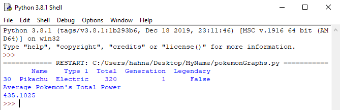
poke_common = poke_stats[(poke_stats['Legendary'] == False) & (~poke['Name'].str.contains('Mega'))].drop_duplicates('Name', keep='first')
print("\nAverage Pokemon's Total Power")
print(poke_common.Total.mean())
The result is 405.96.
Fine, you've now got the data that shows that pikachu is below average for all the pokemon. But let's compare pikachu with just the pokemon from generation 1, then compare pikachu with just the other electric types from generation 1.
import pandas as pd
from matplotlib import pyplot as plt
poke = pd.read_csv("Pokemon.csv")
poke_stats = poke[['Name', 'Type 1', 'Total', 'Generation', 'Legendary']]
print(poke_stats[poke_stats['Name'] == 'Pikachu'])
poke_common = poke_stats[(poke_stats['Legendary'] == False) & (~poke['Name'].str.contains('Mega'))].drop_duplicates('Name', keep='first')
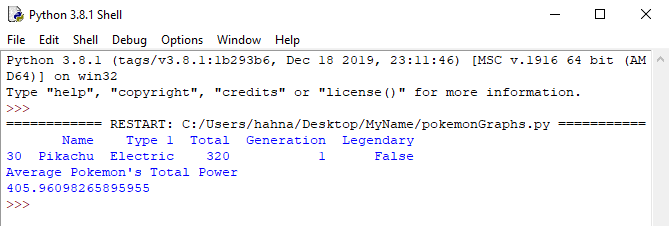
poke_gen1 = poke_common[poke_common['Generation'] == 1]
poke_electric = poke_gen1[poke_gen1['Type 1'] == 'Electric']
print("\nAverage Pokemon's Total Power")
print(poke_electric.Total.mean())
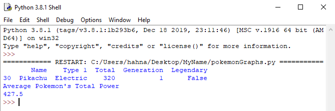
Oh no. By being more specific, it looks like pikachu's stats look even worse by comparison. It's time to make a recommendation to Ash. If he wants a more powerful pokemon than pikachu on his team, what pokemon should he pick? We've already shown how to rank order pokemon by power in the previous lesson, now we're going to illustrate the power of pokemon in a chart so Ash can make a good decision.
Bar Graphs
The matplotlib module lets us create graphs which can show pikachu's power relative to the other potential electric types Ash could pick. To show this, we're going to use a sorted bar chart.
To create a bar chart, we're going to use the plt.bar() function. There are two arguments that we need to specify, what we want to measure along the y-axis, and what labels we want to show on the x-axis.
First, we're going to create a dataframe where the results are sorted by total power.
Then, we're going to use the plt.bar() function. The x argument will be the names of the different pokemon, and the height of the bars will be determined by the Total power of each of the pokemon.
For a bar graph, you always need to specify the
xvalue for the bar chart, and the
heightvalue for the bar chart. The bar chart function's arguments act like a map, they add a new section of the graph for each value in the lists you provide.
import pandas as pd
from matplotlib import pyplot as plt

poke = pd.read_csv("Pokemon.csv")

poke_stats = poke[['Name', 'Type 1', 'Total', 'Generation', 'Legendary']]

print(poke_stats[poke_stats['Name'] == 'Pikachu'])

poke_common = poke_stats[(poke_stats['Legendary'] == False) & (~poke['Name'].str.contains('Mega'))].drop_duplicates('Name', keep='first')

poke_gen1 = poke_common[poke_common['Generation'] == 1]
poke_electric = poke_gen1[poke_gen1['Type 1'] == 'Electric']

poke_electric_chart = poke_electric.sort_values(by='Total', ascending=False)

plt.bar(x=poke_electric_chart['Name'], height=poke_electric_chart['Total'])
plt.show()
After running the module, you will see a chart appear that shows the different electric type pokemon that Ash could choose. And it looks like not only was Ash incorrect in his assumption that pikachu was
the best, but the exact opposite was true! According to the power statistics we have from this dataset, pikachu is the weakest pokemon!
Although it may be tempting to simply tell Ash that he should replace pikachu, when solving problems through data science it's also important to know our own limits. Ash may have knowledge of factors outside the data that we have that might influence his decision. It's our responsibility to tell the pokemon trainer what we know, but it's ultimately up to them to make the right decision for their team.
The Competition
Ash has told us that he wants to become the pokemon master, but in order to do that, he's going to need to defeat his rival, Gary. It's time to do some more comparisons of their two teams to see how they stack up.
Here's the current pokemon from Ash's team:
1. Pikachu
2. Butterfree
3. Pidgeot
4. Bulbasaur
5. Charizard
6. Squirtle
Here's the pokemon that are on Gary's team:
1. Pidgeot
2. Alakazam
3. Rhydon
4. Exeggutor
5. Arcanine
6. Blastoise
Now that we know the two team compositions, let's compose two different dataframes of the teams.
First, we create two lists of each of the teams. You can comment out or delete your existing code.
import pandas as pd
from matplotlib import pyplot as plt

poke = pd.read_csv("Pokemon.csv")

ash_list = ['Pikachu', 'Butterfree', 'Pidgeot', 'Bulbasaur', 'Charizard', 'Squirtle']
gary_list = ['Pidgeot', 'Alakazam', 'Rhydon', 'Exeggutor', 'Arcanine', 'Blastoise']
Next, we can use the isin() function for our filter. It will get all the rows from the dataframe where the values match the values in our lists.
import pandas as pd
from matplotlib import pyplot as plt

poke = pd.read_csv("Pokemon.csv")

ash_list = ['Pikachu', 'Butterfree', 'Pidgeot', 'Bulbasaur', 'Charizard', 'Squirtle']
gary_list = ['Pidgeot', 'Alakazam', 'Rhydon', 'Exeggutor', 'Arcanine', 'Blastoise']

poke_ash = poke[poke['Name'].isin(ash_list)]
poke_gary = poke[poke['Name'].isin(gary_list)]
Finally, we create two separate graphs by using the plt.figure() function. This lets us create information for each graph at a time, and then show both of them at the end so we can compare the results. Running the below code will create 2 graphs, not just one.
You use plt.figure() to specify which graph you want to add content to. The argument for the function will determine which graph you want to work on.
import pandas as pd
from matplotlib import pyplot as plt

poke = pd.read_csv("Pokemon.csv")

ash_list = ['Pikachu', 'Butterfree', 'Pidgeot', 'Bulbasaur', 'Charizard', 'Squirtle']
gary_list = ['Pidgeot', 'Alakazam', 'Rhydon', 'Exeggutor', 'Arcanine', 'Blastoise']

poke_ash = poke[poke['Name'].isin(ash_list)]
poke_gary = poke[poke['Name'].isin(gary_list)]

#Creates the bar graph for Ash
ash_graph = plt.figure(1)
plt.bar(x=poke_ash['Name'], height=poke_ash['Total'])
plt.title("Ash's Pokemon Team")

#Creates a separate bar graph for Gary
gary_graph = plt.figure(2)
plt.bar(x=poke_gary['Name'], height=poke_gary['Total'])
plt.title("Gary's Pokemon Team")
plt.show()
Oh dear. As hard as Ash might train, the comparison here shows that Ash's team has a lot of work to do to improve. In particular, the weak links of his team are Pikachu, Squirtle, and Bulbasaur.
You present this data to Ash, and ask him if he really wants to challenge his rival for the pokemon championship.
Wait!he tells you,
What if I changed out the Pikachu for Raichu, changed Squirtle for Blastoise, and changed Bulbasaur for Venusaur?
Try to change out the list of the pokemon team to see how strong it is with the changed team members.
Next, we'll go over some other types of charts that you can use with matplotlib
Other Chart Types
There are a large number of different types of charts you can make with matplotlib, but we'll cover a few of them here.
1. Stacked Bar Chart: Use this chart type when you want to break down one bar into multiple parts.
2. Boxplot: Helpful when you want to show how wide a range of potential values is
3. Scatterplot: Useful when you have a large number of data points across two axes, and you want to find where there are clusters of data
4. Line Graph: Useful when you want to show how a variable changes in relation to another variable. For example, you could track the change in a variable over time.
5. Word Cloud: Can be used to show the most frequently used words in a text file.
If you want to learn more about different types of graphs, you can see additional graph code examples in the Python Graph Gallery
Stacked Bar Chart
Let's start with the Stacked Bar chart. You can comment out or delete your existing work for now. The total stats of a pokemon are composed of multiple parts. Instead of viewing the sum totals of each pokemon's stats, how about we view all the parts individually?
This way, we can break up ash's team and figure out if different pokemon have different skill sets on his team.
This code will be more complicated than the other charts we have made, because there are a lot of individual stats that describe a pokemon's abilities.
import pandas as pd
from matplotlib import pyplot as plt

poke = pd.read_csv("Pokemon.csv")

ash_list = ['Pikachu', 'Butterfree', 'Pidgeot', 'Bulbasaur', 'Charizard', 'Squirtle']
poke_ash = poke[poke['Name'].isin(ash_list)]

# Creates individual lists of each stat from the dataframe, will be one section in the bar
hp_stats = poke_ash['HP']
attack_stats = poke_ash['Attack']
defense_stats = poke_ash['Defense']
speed_stats = poke_ash['Speed']
special_attack_stats = poke_ash['Sp. Atk']
special_defense_stats = poke_ash['Sp. Def']

# The first element here will appear at the bottom of the chart.
# A third argument has been added, color. Each stat will have a different color
plt.bar(x=poke_ash['Name'], height=hp_stats, color='#00ff00')

# For each of the remaining elements a 4th argument has been added, bottom.
# Bottom indicates how far up from the bottom of the chart a bar section should begin.
# As you add more sections, you need to start from the height of the combination
# of all the previous sections
plt.bar(x=poke_ash['Name'], height=attack_stats, bottom=hp_stats, color='#ff0000')
plt.bar(x=poke_ash['Name'], height=defense_stats, bottom=(hp_stats+attack_stats), color='#0000ff')
plt.bar(x=poke_ash['Name'], height=speed_stats, bottom=(hp_stats+attack_stats+defense_stats), color='#ffff00')
plt.bar(x=poke_ash['Name'], height=special_attack_stats, bottom=(hp_stats+attack_stats+defense_stats+speed_stats), color='#990099')
plt.bar(x=poke_ash['Name'], height=special_defense_stats, bottom=(hp_stats+attack_stats+defense_stats+speed_stats+special_attack_stats), color='#440044')
plt.title("Ash's Pokemon Team Stats Breakdown")

# This section of code will create a legend so that people can see which color means which stat
stat_types = ['HP', 'Attack', 'Defense', 'Speed', 'Sp. Atk', 'Sp. Def']
# The loc argument indicates the location of the chart. loc=1 means it will display at the top right of the chart
plt.legend(stat_types, loc=1)

plt.show()
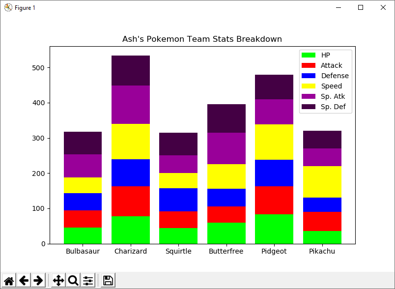
This is a Stacked Bar Chart and is useful when showing how a total is broken down into different parts. By using this chart, we can see that some pokemon have higher stats in certain areas than others.
Boxplot
For our boxplot we're going to try to answer the question: which pokemon type is generally the strongest? Instead of checking which type has the single strongest pokemon, by looking at the range of strength for all pokemon in that type we can come up with the type where you are likely to find a strong pokemon.
import pandas as pd
from matplotlib import pyplot as plt

poke = pd.read_csv("Pokemon.csv")

poke_stats = poke[['Name', 'Type 1', 'Total', 'Generation', 'Legendary']]

print(poke_stats[poke_stats['Name'] == 'Pikachu'])

poke_common = poke_stats[(poke_stats['Legendary'] == False) & (~poke['Name'].str.contains('Mega'))].drop_duplicates('Name', keep='first')

poke_common.boxplot(column='Total', by='Type 1')
plt.show()
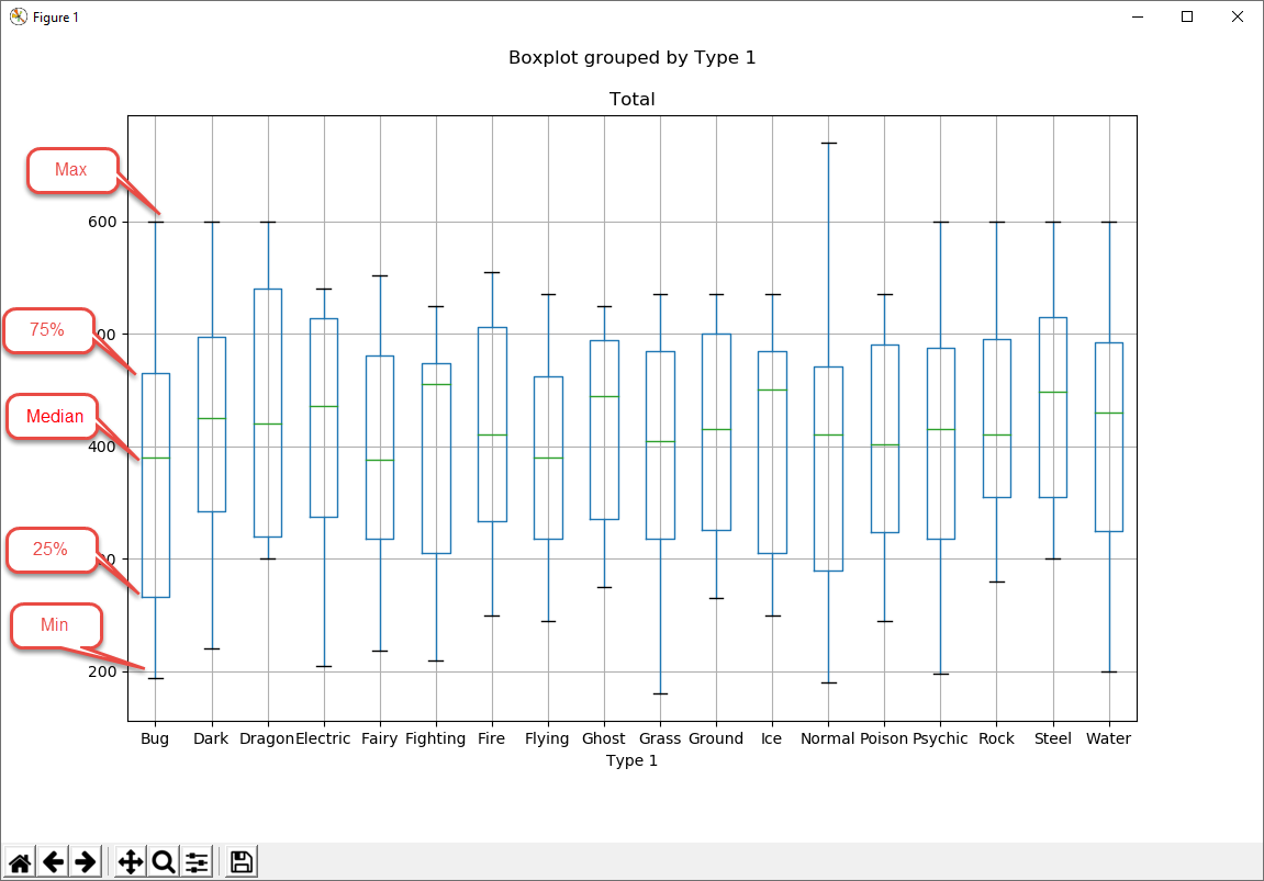
The box plot has 5 different parts. The top line shows the highest value for the category (Max). Where the box ends at the top represents the 75% percentile, so 25% of pokemon are stronger than the end of the box. The middle of the box is the median strength for that category. That pokemon is the middle value out of all the different pokemon's strengths. The bottom of the box represents the 25% percentile, so 25% of pokemon are weaker than that value. The final bottom line shows the weakest strength for that category.
Scatterplot
The Scatterplot allows you to plot individual values along both an x and a y coordinate. We can use this graph to find out interesting information about the relationship between the attack and defense of pokemon.
import pandas as pd
from matplotlib import pyplot as plt

poke = pd.read_csv("Pokemon.csv")

poke.plot.scatter(x='Attack', y='Defense', title='Pokemon Attack and Defense')
plt.show()
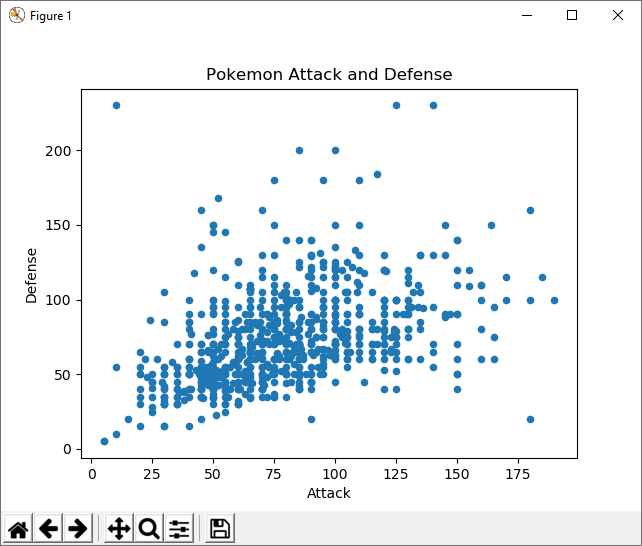
By using this chart, you can see that there are some outliers that have high attack and low defense, and some pokemon that have low attack and high defense. If you need a pokemon for a specific purpose, it might be good to use this type of chart to find clusters or outliers.
Scatterplots are frequently used when you want to show hundreds of values on one chart, and let the viewer see the correlations between the variables in the data.
Questions and Challenges
If you want more practice putting together graphs, try to put together graphs that show answers to these questions.
Try to create different types of graphs out of the same data and see which one most clearly explains the answer to the question.
1. Power by Generation each
Generationstands for a group of pokemon that were added to the roster of total pokemon when a game was released. The lowest numbers come from earlier games, and the higher numbers come from later games. How have stats changed from generation to generation? Are pokemon getting more powerful, or weaker?
2. Type Representation Create a bar chart that orders pokemon by their type. Which are over-represented and which are under-represented.
3. Stat Correlations Create different scatterplot charts of combinations of stats. Which stats are most correlated to each other? HP and Defense? Attack and Speed?
Still up for more? Take a look at the dataset that you found as part of the dataset analysis lesson. If you had to describe this dataset visually to someone in 3 graphs or less, which graphs would you put together for someone to understand your dataset?